How to Make AI-Generated Classroom Flyers That Actually Look Professional
I’ve seen a couple of conversations recently from parents talking about school flyers that were very obviously made with AI. And their biggest complaint wasn’t really that teachers were using AI.
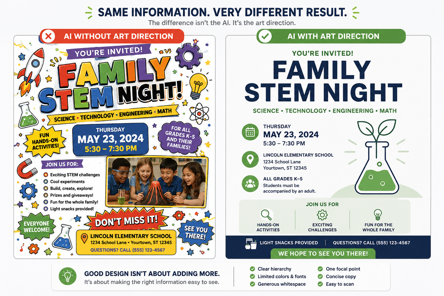
It was that the flyers were so busy. Lots of colors. Lots of fonts. Lots of little illustrations. Decorative borders. Icons everywhere. Every piece of information fighting to be the most important thing on the page.
If you’ve experimented with using AI to make a classroom flyer, newsletter, or parent handout, you probably know exactly what I’m talking about. You ask for something fun, colorful, and engaging for an elementary classroom, and AI enthusiastically gives you ALL THE THINGS.
The good news is that this doesn’t mean AI is bad at helping us create classroom materials. It usually just needs better art direction. And you absolutely do not need to be a graphic designer to give it that direction.
The Problem Isn’t AI. It’s the Lack of Constraints.
Think about what happens when you give AI a prompt like:
Create a fun, colorful flyer for our elementary school Family STEM Night.
There’s nothing technically wrong with that prompt.
But think about how many design decisions you’ve just handed over.
- What colors should it use?
- How many colors?
- What should the reader notice first?
- Should there be illustrations?
- How many?
- What information deserves the most space?
- What should be grouped together?
- How much whitespace should there be?
- What does “fun” look like?
AI has to make all of those decisions for you.
And when we’re talking about elementary education, words like fun, colorful, kid-friendly, and engaging tend to produce designs with more.
More colors. More illustrations. More decorative elements. More icons. More visual effects.
That’s how we end up with the classic AI flyer where every available inch of the page seems to be yelling:
LOOK AT ME! I’M FUN!
What we really need to do is give AI some boundaries.
Start With the Information, Not the Design
Before you ask AI to create anything, decide what actually needs to be communicated.
For a school event flyer, that might be:
- Event name
- Date
- Time
- Location
- Who should attend
- Two or three important details
- What families need to do next
For a weekly classroom newsletter, you might need:
- Specials schedule
- Important dates
- What we’re learning
- Theme or spirit days
- Reminders
- Looking ahead
Give AI the actual information whenever possible instead of asking it to invent the content and design the page simultaneously. This also gives you an opportunity to decide what’s actually important. Because here’s one of the biggest secrets to creating a cleaner design: Not everything needs to be on the page. And not everything that is on the page needs the same amount of attention.
Decide What Parents Should Notice First
This is where visual hierarchy comes in.
“Visual hierarchy” sounds like a graphic design term, but the concept is incredibly simple:
What should someone notice first? Then what? Then what?
Imagine a parent glancing at a flyer while standing at the kitchen counter. They probably aren’t carefully studying your design. They’re scanning it.
For an event flyer, maybe the hierarchy is:
- Family STEM Night
- Thursday, May 23
- 5:30–7:30 PM
- Lincoln Elementary
- Here’s what we’ll be doing
That’s very different from giving Family STEM Night, FREE SNACKS, ALL GRADES WELCOME, THURSDAY, FUN ACTIVITIES, and DON’T MISS IT! their own giant colorful banners.
When everything is emphasized, nothing is emphasized. Tell AI what’s most important. You can literally put this in your prompt:
The event title should be the primary focal point. The date, time, and location should be the second most noticeable information. Supporting details should have less visual weight.
That one instruction can make a surprisingly big difference.
Give AI an Actual Design System
You don’t have to specify every pixel.
Just give it some guardrails.
Limit the Color Palette
Try asking for:
Use a maximum of three coordinated colors.
That doesn’t mean every classroom design has to be beige and boring. You can absolutely make something cheerful and colorful. The difference is that color becomes intentional. If every section is a different color, color stops helping the reader understand the page.
Limit the Typography
You can also ask AI to:
Use one or two font styles with variations in size and weight to create hierarchy.
You don’t need a bubble font, handwriting font, serif font, sans serif font, and decorative display font all living together on one 8.5-by-11-inch page.
Your headline can still have personality. Everything else just doesn’t need to compete with it.
Ask for Whitespace
This is one I would explicitly put in your prompts:
Use generous whitespace between sections.
Whitespace isn’t wasted space.
It gives our eyes a chance to separate one piece of information from another.
You don’t have to fill every inch of the page just because there’s room available.
Stop Giving Everything an Icon
This might be one of the easiest ways to spot an AI-heavy design.
- Calendar icon.
- Clock icon.
- School icon.
- Backpack icon.
- Pencil icon.
- Star.
- Heart.
- Lightbulb.
- Megaphone.
- Another star.
Sometimes icons are genuinely helpful.
A small calendar symbol next to the date can make information easier to scan. An envelope beside contact information can serve a purpose.
But an icon does not need to accompany every single thought.
I like to use this question:
Does this visual help communicate something, or is it just filling space?
If it’s only filling space, try removing it.
The same goes for borders, banners, stickers, doodles, shadows, gradients, patterns, and decorative illustrations.
You can actually tell AI:
Do not add decorative elements unless they improve communication.
And I would go one step further:
When in doubt, remove an element rather than add one.
Not Every Section Needs a Box
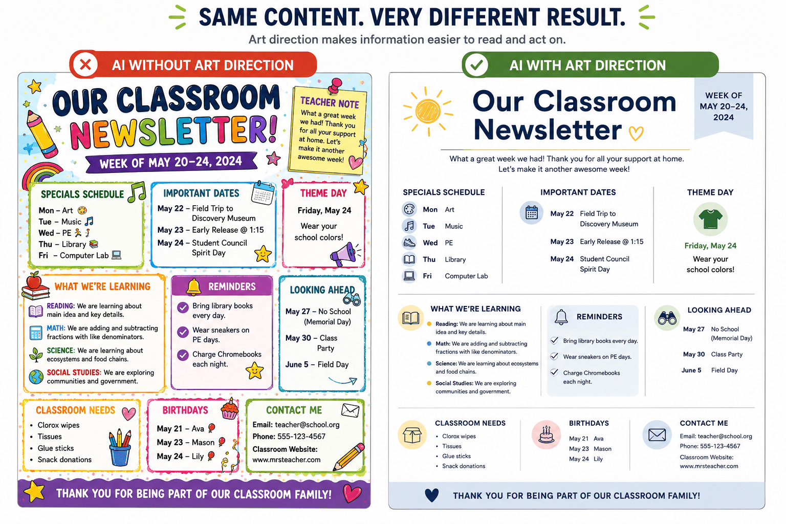
AI loves boxes. Put the specials schedule in a box. Put important dates in another box. Put reminders in a box. Put the teacher note in a box. Give each box a different background color. Add an icon to every heading.
And suddenly you’ve created a page with eight different things competing for attention. Sometimes you need a box because you genuinely want to separate or emphasize information. But often, a little whitespace and a simple heading will do the same job much more effectively. This is especially noticeable in classroom newsletters.
You can have a LOT of information on a weekly newsletter without making the page feel overwhelming. The goal isn’t necessarily to remove all of the information.
It’s to remove the visual competition between the information.
Try the Parent Scan Test
Here’s a really simple test you can use before you send a flyer or newsletter home.
Look at it for about five seconds.
Can you immediately answer:
- What is this?
- What do I need to know?
- Is there something I need to do?
- When does it happen?
If you can’t find those answers quickly, the design probably needs another editing pass.
And remember: you already know what’s on the page.
A parent doesn’t.
You’re looking at the design with context. They’re opening an attachment while making dinner, checking backpacks, answering a text, and trying to remember whether tomorrow is library day.
Make the important information incredibly easy for them to find.
You Don’t Have to Let AI Do the Whole Thing
This is probably my biggest practical recommendation. AI can be fantastic for helping you develop the visual concept for a classroom flyer or newsletter. That doesn’t mean the finished AI-generated image has to be the thing you send home. For information-heavy designs, I often prefer this workflow:
AI → visual concept/layout → Canva, Google Slides, or PowerPoint → finished material
Let AI help you figure out the structure, visual style, illustration, or layout.
Then recreate or finish the design somewhere that gives you complete control over the text. There are a few big advantages to this. First, you can make sure every word is correct. Second, your text remains editable.
If someone changes the field trip time tomorrow morning, you don’t have to regenerate an entire image and hope you like the next version just as much. And third, you have much better control over accessibility, font size, spacing, alignment, and readability. AI can be part of your design process without being responsible for every part of the final product.
Your First AI Design Is a Draft
This is another mindset shift that helps tremendously.
If you were creating a flyer yourself in Canva or PowerPoint, you probably wouldn’t expect every element you added to stay exactly where you first put it. You’d move things around. Delete something. Make a heading bigger. Shorten a paragraph. Decide that you don’t actually need that illustration.
AI-generated designs deserve the same editing process.
When AI gives you something that’s almost right, don’t immediately start over.
Tell it:
Simplify this design.
Or:
Remove approximately half of the decorative elements while preserving the information hierarchy.
Or:
Keep the existing structure, but increase the whitespace and reduce the number of visual elements.
Sometimes the best prompt isn’t asking AI to create something new.
It’s asking AI to edit itself.
Words You Can Use to Get Cleaner AI Designs
If you’re not sure how to describe the look you want, try incorporating words and phrases like:
- Clean
- Professional
- Uncluttered
- Restrained
- Easy to scan
- Clear visual hierarchy
- Generous whitespace
- Minimal decorative elements
- Consistent typography
- Limited color palette
- One focal point
- Information-first
- Warm but professional
And don’t be afraid to describe what you don’t want.
For example:
Avoid excessive icons, clip art, stickers, doodles, gradients, shadows, decorative borders, patterned backgrounds, and unnecessary illustrations.
Negative instructions can be incredibly useful when you’re trying to stop AI from decorating every available corner.
A Prompt You Can Save
Here’s a starting point you can customize the next time you’re creating a flyer, newsletter, or parent handout with AI:
Create a clean, professional [flyer/newsletter/handout] for an elementary school audience using the information I provide below.
The primary audience is parents and caregivers, so prioritize quick scanning and readability over decoration.
Establish a clear visual hierarchy. Use one obvious focal point, a maximum of three coordinated colors, consistent typography, and generous whitespace.
Group related information together. Not every section needs a box, icon, background color, or illustration.
Avoid excessive decorations, gradients, shadows, doodles, stickers, clip art, decorative borders, patterned backgrounds, and unnecessary icons.
Keep the overall style warm and appropriate for an elementary school without making it visually childish or cluttered.
Do not add information that I haven’t provided.
Before finalizing the design, remove any visual element that does not improve communication.
Here is the information to include:
[PASTE YOUR INFORMATION HERE]
You can customize that further by giving AI your school colors, specifying a particular page size, describing the one illustration you’d like included, or explaining which piece of information should receive the most attention.
“Kid-Friendly” Doesn’t Have to Mean Busy
I think this is the bigger idea behind all of this.
We’re creating materials for elementary schools, so of course we want them to feel welcoming.
We can use color. We can use illustrations. We can make things fun. We can absolutely create something that feels like it belongs in an elementary school.
But kid-friendly and visually overwhelming are not the same thing.
And when the audience is parents and caregivers, we aren’t really designing for children in the first place.
We’re designing information that adults need to understand quickly.
AI is an incredible tool for helping us do that faster. We just can’t expect it to make every design decision for us. Give it the content. Tell it what’s important. Give it some constraints. Let it create. And then use your own judgment to decide what stays. Because getting a more professional-looking design from AI usually isn’t about figuring out how to get AI to add more.
It’s about getting really good at telling it what to leave out.